Topographic Maps: The Art and Science of Making Mountains out of Molehills
We’ve all seen topographic maps before, but have you ever stopped to appreciate the art and science that goes into creating them? The World in Relief: The Art and Science of Topographic Maps is a fascinating topic that explores the intricacies of terrain mapping.
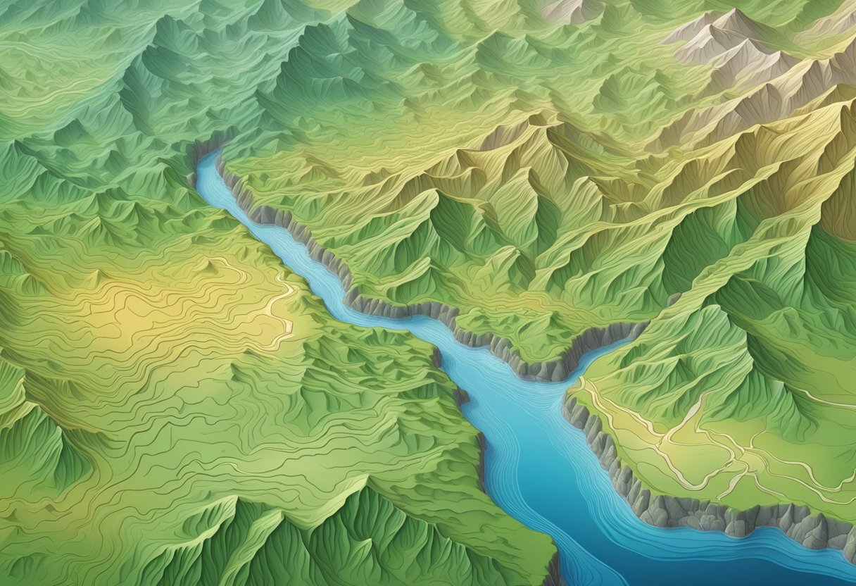
One of the key elements of topographic maps is contour lines. These lines, which represent different elevations, are like the Earth’s autograph. They tell a story of the land, the mountains, the valleys, and the rivers. It’s amazing to think that these lines are able to convey so much information about the terrain.
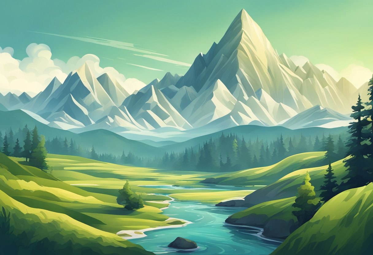
Mapping the world is no easy feat, but topographic maps have been able to capture the grandest of canyons and the smallest of molehills. These maps are not only functional but also beautiful works of art. They showcase the terrain of our planet in a way that is both informative and visually stunning.
Key Takeaways
- Topographic maps are a combination of art and science that showcase the intricacies of terrain mapping.
- Contour lines are a key element of topographic maps and represent different elevations of the land.
- Topographic maps are not only functional but also beautiful works of art that capture the grandest of canyons and the smallest of molehills.
Contour Lines: The Earth’s Autograph
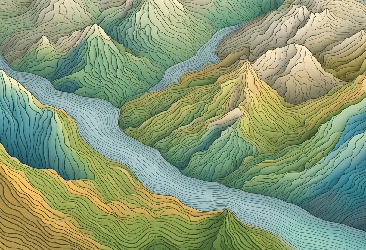
When it comes to topographic maps, contour lines are like the Earth’s autograph. They tell us everything we need to know about the shape and elevation of the land, and they do it with style. In this section, we’ll take a closer look at these fascinating lines and explore the art and science of mapping the world in relief.
Deciphering Elevation: A Vertical Endeavor
At the heart of any topographic map are the contour lines, which represent the elevation of the land. These lines are drawn at regular intervals, with each line representing a specific elevation above sea level. By reading the contour lines, we can get a sense of the shape of the land, including hills, valleys, and ridges.
But deciphering the elevation of a landscape is no easy feat. It requires a keen eye for detail and a good understanding of the interval between the contour lines. For example, if the interval is 10 meters, then each contour line represents a rise or fall of 10 meters. By counting the lines, we can calculate the elevation of any point on the map.
Hachuring vs. Shaded Relief: Battle of the Illusions
When it comes to representing the elevation of the land, there are two main techniques used in topographic maps: hachuring and shaded relief. Hachuring involves using short lines to indicate the slope of the land, while shaded relief uses light and shadow to create the illusion of depth.
Both techniques have their pros and cons. Hachuring can be more precise in showing the exact slope of the land, but it can also be more confusing to read. Shaded relief, on the other hand, can be easier to understand at a glance, but it can also be less accurate in representing the actual slope of the land.
In the end, it’s up to the mapmaker to decide which technique to use. But no matter which method is chosen, the contour lines remain the backbone of the map, providing the essential information we need to navigate the world in relief.
Mapping the World: From Grand Canyons to Molehills
https://www.youtube.com/watch?v=3RVkATpDEfc&embed=true
As cartographers, we take great pride in our ability to accurately represent the Earth’s surface. And when it comes to topographic maps, we’re the top dogs. But how did we get here? Let’s take a look at the history of topographic mapping, from the Grand Canyon to the humble molehill.
Topographic Titans: USGS and the National Geospatial Program
The United States Geological Survey (USGS) has been at the forefront of topographic mapping since the late 1800s. Their maps are renowned for their accuracy and level of detail, and they continue to push the boundaries of what’s possible.
In recent years, the USGS has teamed up with the National Geospatial Program to create the US Topo series. These maps are created using photogrammetry and aerial photography, and are available in both digital and print formats. They’re also free to download, which is great news for budget-conscious cartographers like us!
From Photogrammetry to KMZ: Technological Tango
Photogrammetry has been a key tool in topographic mapping for over a century. By taking overlapping aerial photographs and using them to create 3D models, cartographers can accurately represent the Earth’s surface.
But photogrammetry is just one part of the technological tango that is topographic mapping. In recent years, we’ve seen the rise of digital mapping tools like KMZ, which allow us to create interactive maps with ease. And with advances in data processing and storage, we can now create maps with even greater accuracy and detail.
The Global Gallery: Topographic Maps from Europe to Australia
While the USGS may be the top dog in topographic mapping, they’re not the only game in town. Cartographers around the world are creating stunning topographical maps, from the mountains of Europe to the deserts of Australia.
One thing that sets these maps apart is their use of local data and expertise. Cartographers in Alaska, for example, have to contend with unique geographical features like permafrost and glaciers. And in Australia, cartographers have to deal with a vast and varied landscape that includes everything from mountains to beaches.
So whether you’re mapping the Grand Canyon or a humble molehill, there’s never been a better time to be a topographic cartographer. With new tools and techniques at our disposal, we’re able to create maps that are more accurate and detailed than ever before.
Frequently Asked Questions
What’s the deal with all those squiggly lines on a topographic map?
We know it looks like a bunch of spaghetti thrown on a piece of paper, but those squiggly lines are actually contour lines that represent changes in elevation. Each line represents a specific elevation, and the closer the lines are together, the steeper the slope. So, if you’re planning a hike, you can use these lines to figure out how difficult the terrain will be.
If I’m lost in the wilderness, how can a topographic map help me find my way… or at least civilization?
Well, if you have a topographic map and a compass, you can use the contour lines to figure out which direction to go. If you’re lost, you can use the map to identify nearby landmarks, such as mountains or rivers, and use those to navigate. Plus, if you’re really in trouble, you can use the map to signal for help by creating a large “X” on the ground that can be seen from the air.
Can you explain how topographic maps are like the ‘cheat codes’ for understanding Earth’s surface features?
Think of a topographic map as a cheat code for understanding the Earth’s surface. It gives you an inside look at the landscape, revealing all the bumps, hills, and valleys that make up our planet. With a topographic map, you can see the shape of the land, the location of rivers and streams, and even the location of man-made structures like roads and buildings.
Why do earth scientists get all excited about topographic and relief maps?
Earth scientists get excited about topographic and relief maps because they reveal so much about the Earth’s surface. By studying these maps, scientists can learn about the geological processes that have shaped our planet over millions of years. They can also use these maps to identify areas that are at risk for natural disasters like landslides and earthquakes.
How do I read a topographic map without getting a headache from all the contour lines?
We won’t lie, reading a topographic map can be a bit overwhelming at first. But with a little practice, you’ll be a pro in no time. Start by identifying the contour interval, which tells you how much elevation change each line represents. Then, look for the index contour lines, which are darker and usually labeled with their elevation. From there, you can work your way up or down the map by following the contour lines.
What makes a relief map different from a pirate’s treasure map, besides the lack of ‘X marks the spot’?
Relief maps are different from pirate’s treasure maps in that they don’t lead you to buried treasure (unfortunately). Instead, they show a three-dimensional representation of the Earth’s surface. They use shading and color to show the elevation of different areas, giving you a sense of the shape and topography of the land. Think of it as a 3D map that you can touch and feel.